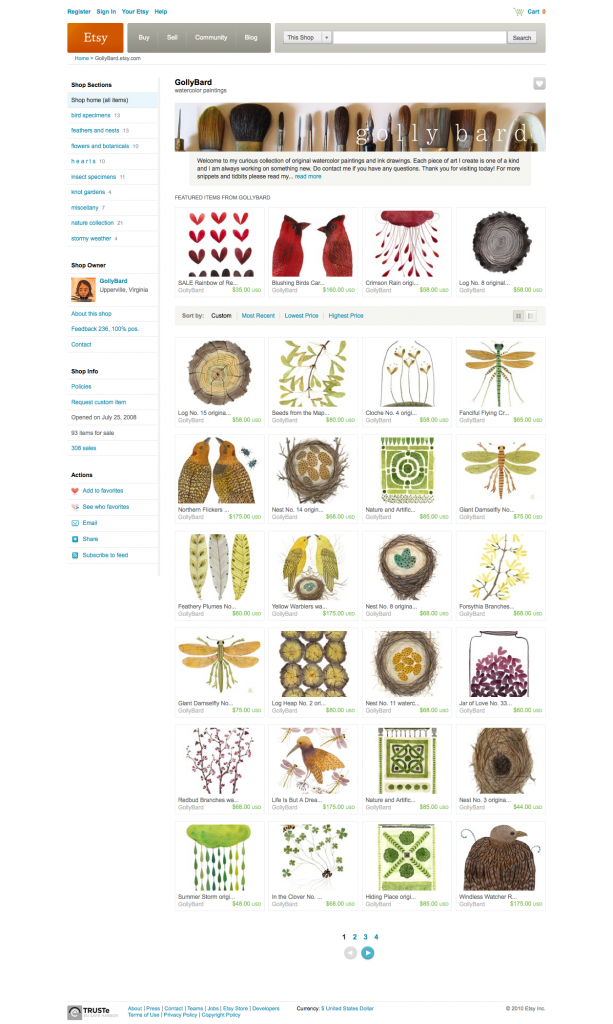
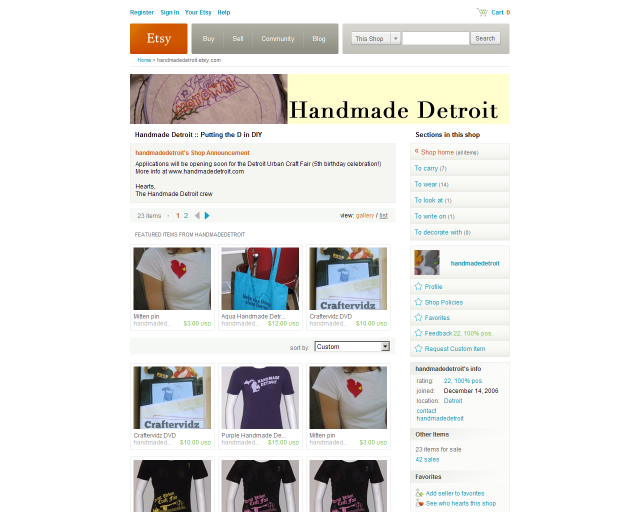
The Etsy community is buzzing with word that shop pages are getting a facelift. The new look matches the wider front page look, unveiled in May. There will be room for one more featured item and the navigation will switch to the left. In turn, there will be less room for announcements.
Here’s the new Etsy shop look:
And for comparison, here’s the current shop page look:
So, what do you think of the changes?
Learn about the rest of the Etsy shop page changes from the Etsy blog.


